Group 4: The Yellow Cartographer
Pimrampai Vannacharoen
[pv2105@columbia.edu]
John Cieslewicz [johnc@cs.columbia.edu]
James Rishe [jlr2002@columbia.edu]
Overview
The objective of this project, "How Far Away?" was to ponder the question, "What if maps had a way of showing chronological distance, rather than just geographical distance?" Based on a set of datapoints and the length and speed of links between them, what is the best way to present a map so that someone using the map would know the best route to take between any two points?
A number of strategies for approaching this problem were discussed in class: Should the natural geometry of the area be distorted? If so, how much is too much, or is it alright to completely change the layout of points on the map if doing so will make the map more informative? What is the best way to communicate temporal distance on the map? This task also differed from the classical map problem in that we were given the job of making a system that would automatically generate a map, given only the cities and links as data, printable on letter-size paper, whereas most real world maps are either drawn manually, or automatically based on millions of points of data.
Distortion
One strategy in approaching this problem is distort the map’s geometry, representing chronological distances by adjusting the distance between points, thus the distance proportionally represents the time between points. This would not be very difficult if the graph of the points were a tree or a weakly connected graph, but for a complex map with cycles and many interconnected points, one could easily run into a problem in which adjusting one point's location undoes the adjustment made on another point. We are unsure if such adjustment schemes would be guaranteed to halt, though in class discussions, one group that implemented this strategy insisted that their algorithm would halt. Regardless of the shape of the map, the following pros and cons are inherent in distortion schemes:
Pros:
- Distortion offers the potential of showing time distances by distances on the map, which could be easily interpreted visually by the map's user.
- On a large enough scale, cardinal directions do not matter as much as routes and road names, so a place that is actually North of another place could reasonably be below it on the map.
- For a person who is unfamiliar with a region, locations of points on the map need not correspond to their actual relative locations if a chart adequately directs users to the right areas of the map.
Cons:
- People who are familiar with a region do not want to consult charts to find the locations of places, they want to find those places quickly based on prior knowledge.
- On a small scale, i.e. walking scale, relative directions can be important and informative for someone trying to find their way, and reduces the dependency on road signs, which can be unreliable at times.
- For reasons already stated, making a distortion system that accurately represents the temporal distances proportionally may not even be possible, especially if a map includes links of very different speeds, so a distortion system would most likely be approximate at best.
An Excursion: Hub Separation
Early in the project our group decided to experiment with map distortion for the advantages listed in the preceding section. The strategy we used we call hub separation. The idea was to identify the hubs in a map, grouping nodes into node groups around those hubs by choosing a node group based on which hub is closest by travel time. We then pushed the node groups apart from each other. The hub separation page details our hub separation experiments. Figure 1 shows some of the pitfalls of hub separation. Of primary concern is that most geographic context is lost. When showing this image to others, the most common comment was that it didn’t look like California and that made the map hard to use. A secondary consideration is that the edge between nodes on the fringes of node groups clutters the map. Ideally, hub separation would result in node groups connected to each other by only a few, important links. For these reasons we decided to abandon distortion in order to leverage the map user’s familiarity with geography.
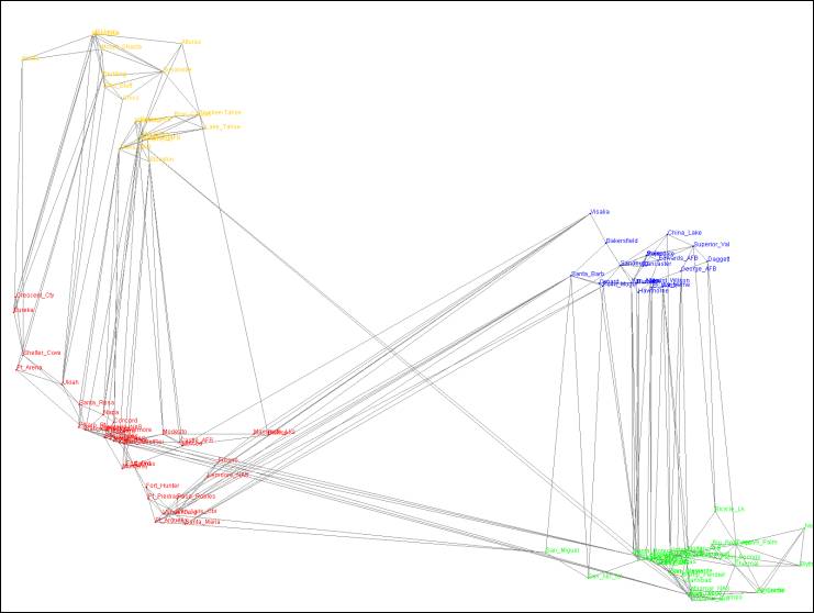
Figure 1 A hub-separated map of California using four hubs.
Our Approach
Scaling the map
We decided to go with the approach of displaying all the points on the map scaled to their relative distance from each other, using no distortion in their positions to indicate travel time. We started by finding the minimum and maximum x and y values out of all the points. If we found that the distance between min y and max y (the height) was more than the width, we scaled the map to a canvas with height:width ratio of 4:3, otherwise we scaled to 3:4. We figured this would be good because it is the ratio for most traditional screens and is the ratio of the space on letter-sized paper with 1/2" margins. We scaled the coordinates with the formula
xscaled = (xreal-xmin)/width * (WIDTH - 100) + 50
and similarly for Y, so that the points are proportionally spaced based on their actual locations, with a 50 pixel margin on all sides.
We encountered two Java-related snags along the
way. The first was that the Point class accepts doubles as
arguments, but stores the numbers as ints, so the points we were storing as
the upper right were actually to the left of one or more points on
the map. We solved this problem by using Point2D, which uses floats or doubles.
The other thing we noticed was that sometimes our maps looked fine and other
times they were squished to the left. We noticed that the squishing
occurred when a map's coordinates contained negative numbers, and was a result
of the way we determined the right boundary. We set a variable equal to
MIN_DOUBLE, and increased it accordingly as necessarily larger coordinates were
found, but the problem is that MIN_DOUBLE, is a tiny positive number, not a
large negative number, so a map with all negative x coordinates would have a
number about equal to 0 as its right bound. We solved this by starting
the variable at -MAX_DOUBLE.
Using color and line thickness
First, we thought that using a combination of color and line thickness to indicate the speed on each link will help the users to have better judgment of which path is the shortest path in terms of travel time. For example, Thick green links indicate the fastest links. Thin green links indicate the second fastest group of links. Thick blue links indicate the third fastest group of links and so on. After the first week, however, we found out that using the combination to instead differentiate the travel time would be a more informative approach. Figure 1 below illustrates our map when we use color and thickness to indicate the speed on each link, while Figure 2 illustrates the map’s appearance when line color and thickness represent link travel time.

Figure 2 In this map, users can tell that the thick green links are fastest but they still cannot tell how long it takes to get from one node to the node on the other end of the same edge.
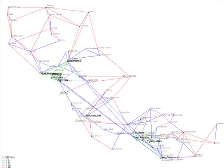
Figure 3 The map of California when we use color and line thickness to indicate travel time between each node.
The problem that we encountered using this scheme is that we have to find the range of time that evenly divides all the links into 3 colors. Since each map has very different travel time scheme, for example, each link in the subway map tends to take the same amount of time to traverse while the time varies greatly in state map. If we take the time on the edge that requires maximal time to travel in the map and divide that number by 6 and assign one slot to each color-thickness pair, that is, thick green, thin green, thick blue, thin blue, thick red, and thin red, we will have a nice subway map with links in 3 different colors. However, with this scheme, we will have a state map with only a couple of thick green links and a lot of red links, which does not help the users much. Therefore, we decided to use standard deviation of the amount of time needed to travel between pairs of directly connected nodes in determining how to assign a slot to each color-thickness pair and make the amount of time assigned to each pair 2 times as large as the adjacent pair that takes shorter amount of time. For example, it takes twice as much time to travel a thick green link as to travel a thin green link. If the map data has high SD, the time clusters on both ends, that is, 0 and maximum, of the spectrum. Therefore, we want our base time to be low to capture this fact. If the map data has low SD, our base time needs not be that low.
Determining hubs
The purpose of hubs is to help users get their bearings when looking at a map because when one looks for a place in a map, he tends to look for a famous place near that place first and look for that place from there.
For each node, we calculate its score to determine whether it is a hub or not. We take the sum of speed on the edges directly connected to the node as its score. We take the top 9% as hubs. The rationale behind this is that the hubs tend to be connected with a lot of links, some of which are very fast. This scheme works well as we can see from the fact that Time Square, Grand Central terminal, and other famous places are picked as hubs in subway map, and San Francisco, Los Angeles, and other big cities, are picked as hubs in California map.
Eliminating Links to Simplify the Map
Removing some links from the map, if possible, is a straightforward way of making the map easier to read. The challenge is to remove only the links that do not contribute to the informational value of the map. Our first link filter removed duplicated links between any two points. Our reasoning was that any fastest path including a link between two points would necessarily use the fastest link between those two points. This filter did not reduce the clutter on the map because it kept the fastest link between directly connected points, thus drawing the same number of lines on the map.
Our next attempt at link elimination was to eliminate all links not appearing on any shortest path. This strategy was discussed by many groups during class and seemed to be applicable to certain classes of maps with many superfluous links. We leveraged the shortest path code written during the aforementioned hub separation excursion to determine the shortest path between all pairs of points, flagging each link on a shortest path as it was used during a shortest path traversal. At the completion of the all-pairs shortest path algorithm, our program eliminated any links not flagged as being part of a shortest path. Group Four’s Alaska map demonstrates the power of link elimination to simplify some maps. The Alaska map data file contains 353 links between 101 nodes, as shown in Figure 3. Through our simple link elimination algorithm, 136 links are eliminated, yielding a simpler map (Figure 4) with no information loss with respect to finding any shortest path. It is important to note that rarely did maps have so many links that could be eliminated, the tournament maps, for instance all had only a handful of such links.

Figure 4 The Alaska map without link elimination. The map contains 101 cities and 353 links.
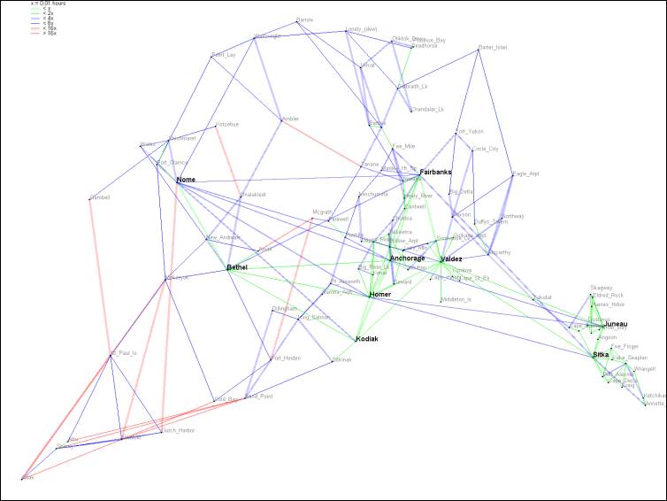
Figure 5 The Alaska map following link elimination. One hundred and thirty six links have been eliminated.
An important issue when using link elimination was whether to run our hub identification algorithm using the full set of links or to run it on the remaining links after the elimination algorithm. We chose to identify hubs after links had been eliminated because this method identifies hubs based on their importance to shortest paths, and important nodes should fall on useful paths rather than useless ones.
Placing the legend
With this color and line thickness scheme, we feel the need to use a legend. However, we do not want to reserve any space for it since we notice that most of the maps that we have seen do not use the space in all 4 corners in the map. We can use one available corner to display legend. Therefore, after drawing the map, we search for the corner with enough space for the legend. If no such corner exists, we put it in the lower left corner. This scheme can be improved by not restricting the legend to be in only one of the 4 corners in the map but wherever in the map that has available space.
Avoiding label overlap
We avoid label overlap by keeping track of the space occupied by labels. Before placing each label, we look for available space around the node and put it there and record the space occupied by this label. If there is no place available at all, we discard the label. The reason is that, if we put this label on the map, this label and the labels under it will not be readable. Therefore, discarding it seems to be a better approach.
We draw the names of non-hubs before hubs. We decided that if the labels of the hubs conflict with the labels of small cities, that is, there is no available space for hub labels after drawing small city labels, we would simply draw the labels of hubs on the labels in that area. The reason is that the labels of hubs are drawn in thicker and bigger font, so they will always be readable even though they are drawn on small city labels. However, we will move the labels of hubs away from each other if they overlap.
Tournament Results
Our final maps, which were used in the tournament, can be found on the tournament page. Our clearest and most useful maps are, by far, the US Capitals and Australia maps. This is because those maps contained data that is more spread out and less densely connected, resulting in a less cluttered map.
Qualitative Results
Overall, our maps received positive qualitative feedback from the judges. James Conlon, an archeologist at Columbia, noted that our “key is good” and the class TA Abhinav Kamra stated that our US Capitals map was “very clear,” making ours the only US Capitals map to receive that rating, the others were merely “clear” or worse. Our map, however, also ran into some difficulty on the more cluttered Northeaster US map, where Professor Ross couldn’t keep track of the confusing path. Through a yet undiagnosed error, our map of Australia omitted the city of Cowes, leading to failure in two separate judge’s paths. The response to our maps was much better than the remarks received by some others, such as “I can’t seem to get there” or “You need to be an astronomer here! I do not know.”
Quantitative Results
Although Abhinav was able to find a path between the start and end points on all maps except Australia, where the missing Cowes caused havoc, only once—on the US Capitals map—did he find the actual shortest path link.
Discussion
Our strategy was similar to many groups in that we used color to represent the speed or time of a link, we worked to avoid label overlap, and we eliminated useless edges from the graph. The hub identification coupled with no distortion on our maps makes it very easy to a user familiar with the region portrayed on the map to orient him- or herself, locating smaller cities by their position with respect to the clearly marked hubs. One limitation of this project was the requirement that the map be printed on letter size paper. For the most part, maps of the detail level included in the game data would be displayed on a larger piece of paper, road atlases for instance are often larger than letter paper as is a roadmap, which unfolds to a very large size. That many of the maps became cluttered is a result of the small canvas space. Reducing the map clutter significantly required removing some information from the map, such as actual geographic location, a complete set of links, or even a complete set of cities. We sought to present the user with a correct answer, eliminating no information necessary to find a shortest path. This strategy, however, hindered users from finding a shortest path in densely connected, cluttered maps, but was quite effective with sparser, more spread out map data such as the US Capitals or Australia.
With respect to accuracy in finding a shortest path, we find that the text-based solution demonstrated by some of the groups should, in theory, be best. This is because is provides an unambiguous path to follow. In practice, however, the strategy did not work well since the table format is not a good format for efficiently showing information, and contains some redundant information. For large sets of map data, these groups had difficulty fitting the text on one page, which in turn resulted in a small font and cluttered layout that was hard to use.
Intuitive use of color and a simple map layout, such as ours, that leverages users’ prior experience with maps and geography seemed best at helping users find a good, if not optimal, path.
October 20, 2004
Group 4 – The Yellow Cartographer
Programming and Problem Solving, Project 2
Columbia University